How to build your brand and educate your audience at the same time
Endearing your brand to your audience will pay dividends over time.
If you’ve liked Market Mix content so far, please share with your friends. 🔺
When you’re talking about digital marketing, there are primarily two kinds of marketing objectives: user acquisition or brand building.
User acquisition is pretty straight forward: you’re working to onboard as many new customers as possible for as cheap as possible.
Brand building is just as simple: you’re working to help raise the awareness of your brand among your target audience.
But in the digital realm, there’s more minutia here than that. The places you run ads are relatively limited. So the website you might run ads to acquire users (e.g. Facebook) is the same platform you’ll probably end up running your brand campaign. So for digital marketers, every campaign is part brand and part acquisition.
As a result, everything you do has to have a piece of both worlds. But how do you plan for that?
This week my team and I at eToro launched a new campaign that we call “Invest in the Future”. This week I’ll help illustrate a bit of a roadmap on how you might approach building a digital campaign.

1. Start with establishing what you want to say
What do you think the first thing most of the general public thinks of when they hear the word “Bitcoin”? More likely than not, it’s something to do with speculative investing.
I know that when crypto comes up in a conversation with my friends, the first thing they say is something to do with market conditions or government regulation. It’s never about utility or real-world use cases.
We decided that we wanted to make a mark in shifting that narrative with an educational brand-building campaign.
This thought experiment resulted in the following question: what if people had more interesting anecdotes about crypto to share with their friends?
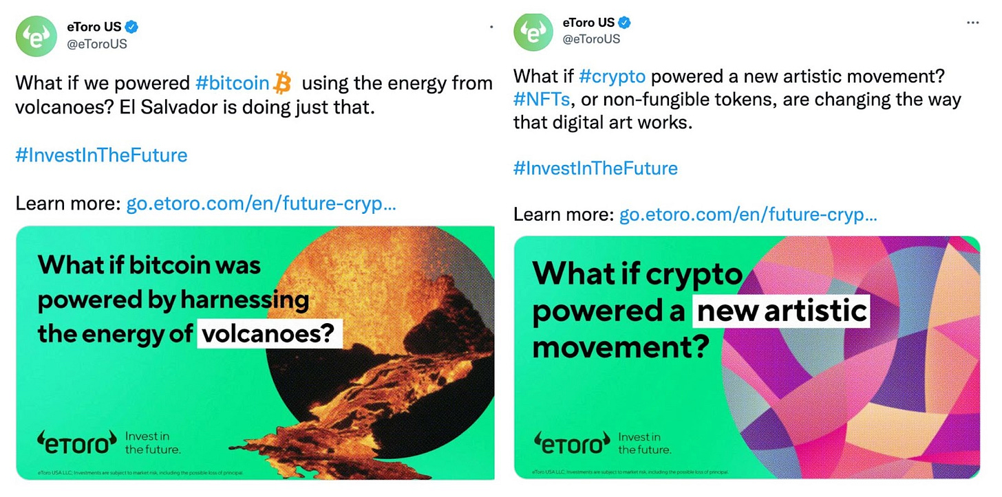
The team took this and came back with a series of questions that pose some “bigger than life” ideas. The kicker? That each creative reflects something real that is happening in the world right now. And we were going to be the brand to tell them about it.
Our thinking here is that if we can send someone to their thanksgiving dinners with the idea that Bitcoin is being powered by volcanoes, or that cryptocurrency adoption is growing at a faster rate than the internet was in 1996, it could spark some conversation. And once that spark of interest is lit, the average person might be a step closer to investing for the first time.
We’re planting a seed. And positioning the eToro brand as a voice in that journey.
2. Build out your creatives for clicks
This is going to seem obvious -- but if your ad is boring, no one’s going to click on it. Sometimes it’s just having a good image, or a good design, or even flashy copy. Best practices differ between industries but always differ between brands.
For us, we knew that paid social was going to be a primary channel for this campaign. With that in mind, we established a couple priorities for our future creatives:
We wanted motion
We wanted to try to work in a visual of the product
For some brands that’s enough. At eToro we always try to provide some sort of extra value for the user, so...
We wanted to prominently feature an incentive offer
So our talented designer came up with a number of creatives that accomplished exactly those three things.
In the above creative, you might notice there is one thing missing -- a call-to-action (CTA) button. It’s worth remembering that these paid social ad placements often have built-in call-to-action buttons (like on Facebook for example). It’s not worth using up valuable real estate for a redundant design element. Know your placements.
Each ad, of course, comes with multiple variations of copy for testing. Don’t underestimate the value of a eye-grabbing headline or caption.
3. Decide where to send the user after they click
An ad by itself isn’t going to translate to much other than an impression, especially when you’re making an education play. So you need to design an experience for after the user clicks on your ad.
There is an entire discipline behind building landing pages. You have UX design, creative copywriting, and your brand’s visual voice all working to accomplish your primary objective. For us, we’re ultimately trying to drive leads. But educating people about these exciting ideas is a key secondary objective.
The first thing the team realized is that we can’t just be asking these questions and moving on. So they created a unique landing page for each ad, providing the answer to each question after a user clicks. The user will also see the other questions asked throughout the campaign and the ability to click on to other LPs from there.
For example, you can see the landing page for the volcano creative you saw earlier here.
So now we’ve got our message, our creatives, and our landing pages. I’m not going to go too far into the exhaustive media plan and placement strategy for this campaign since it’s just kicking off, but I hope that walking you through the thought experiment that led to this campaign will be helpful in your future strategy planning.
As marketers in an emerging industry, it’s our job to come up with strategies that change the way people think about our vertical. The way I see it is that rising tides raise all boats. The better we do at our jobs, the faster we all benefit from that growth.
And if you’re looking for your marketing role in the fintech industry, I’m hiring for a bunch of new roles. Some of those you can find below. 👇


